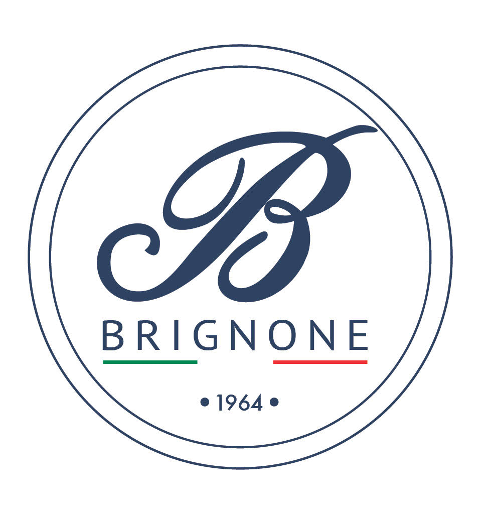
Our Logo - Our Identity 🇮🇹
We have the great fortune of having been born in an exceptional, unique country, Italy.
As a family of artisan pastry chefs, we have had the great resilience of having a history, which has lasted for more than 50 years, in the production of typical sweets of our territory.
Our mission is to want to share these fortunes with as many people as possible.
Keeping unchanged (or at best improving) recipes and everything concerning our world.
As you may have read in our article , the values of history and tradition have always been the founding pillars of our reality.
In this article we would instead like to tell you about our logo and its development over the years.
The birth of the "Brignone" font , the signature of our artisan pastry shop, dates back to the 60s, when the spouses Giuseppina and Celestino Brignone bought what is the current pastry shop in the center of Dronero in via Roma.

YEARS 90-2000

At the end of the 90s and the beginning of the 2000s, the logo acquired a characteristic typically linked to the territory.
It is a graphic, stylized version of the "San Sebastiano kiosk", an old chapel located in the square in front of the Dronero pastry shop, in via Roma.

YEARS 2010-2018 
Since about 2010, the logo is updated a bit.
The signature remains unchanged, a first " claim " is inserted, "Pasticceria Fresca D'Alta Gamma".
The motto wanted to recall the territorial dimension of the brand, linked to fresh pastries (bignole, cakes and fresh pastries in general), and high-end, to underline the great quality that has always distinguished the pastries.
since 2019
And here we come to the latest edition of our logo:

We have arrived at this version after many studies, on what we were, what we are and what we want to continue to be.
Let's try to analyze it together the significant elements:
- Brignone: surname of the family, recalls familiarity and tradition
- 1964 : date of foundation, recalls History , another fundamental value of our reality;
- EXCELLENCE CHOCOLATE FROM PIEMONTE (CLAIM): indicates WHAT WE DO (Excellent and special chocolates - predominantly alcohol-based niche) and WHERE we do it (Piedmont deliberately left in Italian to recall the territoriality)
- ITALIAN FLAG : Italian spirit, which binds us to the territory, but with a strong desire to expand into international markets.
We are proud and proud to carry on the history and tradition of our pastry shop. With an eye to the future and innovation.

